Remote is a fictional homestay / coworking service that offers a profoundly less corporate remote work experience with an emphasis on productivity through positivity.
Logo Design
Remote’s logo was an exploration of combining the qualities of the two brands WeWork and Airbnb.
Both Airbnb and WeWork utilize lowercase logo marks to create a less formal first-impression and have the ability to be supported by logo bugs. I opted to pursue a white logo mark like WeWork so that the creative could be the playground for color exploration and the supporting imagery was centered around destination scenery.
Print Design
With these print designs, I played with the idea of how much space each media could comfortably house. For instance, the OOO billboard actually has the most space, but requires less information to be read at blistering speeds in-passing. The media I explored below included:
Billboard signage
Bus stop advertisement
Metro station signage
Direct mailer
Decks & Reports
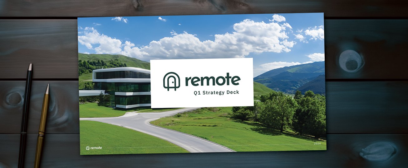
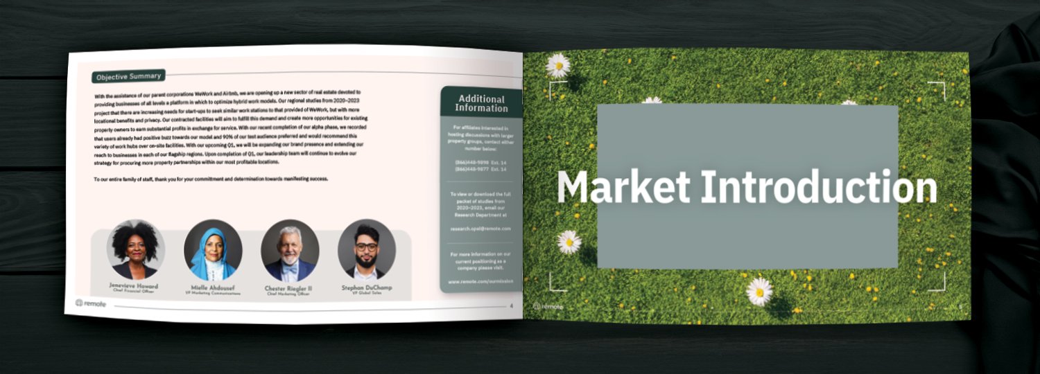
With this case study, I also wanted to spotlight that B2B materials have the ability to avoid falling flat by incorporating more of the essence of the brand.
Throughout the deck examples, I’ve chosen to utilize broad scenic imagery that evokes the feeling of travel and ample breathing room between pages of dense copy to add more balance to the cadence of the read.
Digital Ad Design
With the digital ad examples for this case study, I aimed to demonstrate content that could drive traffic to the website through the promotion of seasonal promos and relatable remote work narratives.


